Miller Associates is an Independent Financial Advisers. Last year we designed their new corporate identity, stationery and appointment cards. Just recently we've completed a 12-page brochure promoting their exclusive Corporate Will product.
4 September 2009
1 September 2009
Pace Micro Technology
Pace is a leading technology developer for the global payTV industry.
Our brief was to design publicity material for the launch of their latest set-top receiver - a product which only differs from its predecessor by having a more stylish exterior casing; Apart from its shape, it is exactly the same product.
But history shows that sometimes a simple change in shape is enough to create a retail bestseller.
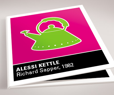
Our solution was to recall examples of where a change in a product's shape was responsible for its dramatic increase in popularity. We illustrated these examples - these design classics - and applied them to publicity posters, advertisements and launch invitations - and refrained from showing the new product altogether, so as to create anticipation at the launch event.
27 August 2009
Tesco Stores
19 August 2009
Scottish & Newcastle
S&N's challenge was to help redress the poor sales of Newcastle Brown Ale in cans, which contrasted considerably with the success of their bottled version - especially popular with students.
Our proposal was to change the can's appearance to closer resemble the bottle. This was achieved by swapping the existing chocolate-brown background to the familiar reddish-brown of the bottled beer. Black illustrations were used to emulate the dark shadows seen within the bottle. These illustrations, evocative of old Soviet propaganda posters, pay tribute to the shipyard and mining industries of the Tyneside area.
The central label was stripped of its decorative detail to leave just basic information, allowing the iconic blue star to be doubled in size.
4 July 2009
Asda Stores
We were asked to develop packaging design concepts for Asda's range of thin & crispy pizza. The target audience was identified as aspirational late 20s/early 30s professionals. We differentiated the five varieties by using contemporary colours for both the product title and the photographic dinner party background.
8 June 2009
Redmayne-Bentley Stockbrokers
Redmayne-Bentley Stockbrokers, who have 37 offices around Britain, were the first to bring stockbroking to the high street by opening 'The Stocks and Shares Shop' in Leeds in 2001.
To celebrate their 125-year anniversary we were asked to produce a shop window display, three in-store posters and an information leaflet. To give a sense of their impressive longevity, we suggested utilising many of the Stock Market's most notable events – historical milestones that the firm has confidently survived since setting up back in 1875.
3 June 2009
8 May 2009
Mauleverer
Mauleverer specialises in the retail of early English oak furniture, antique pewterware and works of art. The name derives from the medieval word for a hunter of small game.
As well as stationery, we also applied the corporate branding to the exterior signage, window display, banner flags and information folder. We also design advertisements for Mauleverer to go in such magazines as Yorkshire Life, Cheshire Life and House & Garden.
Labels:
Advertising,
Banner Flag,
Branding,
Corporate Identity,
Folder,
Illustration,
Logo,
Mauleverer,
Signage,
Stationery
14 April 2009
Lonsdale Financial
6 February 2009
Spring & Company
Subscribe to:
Posts (Atom)